
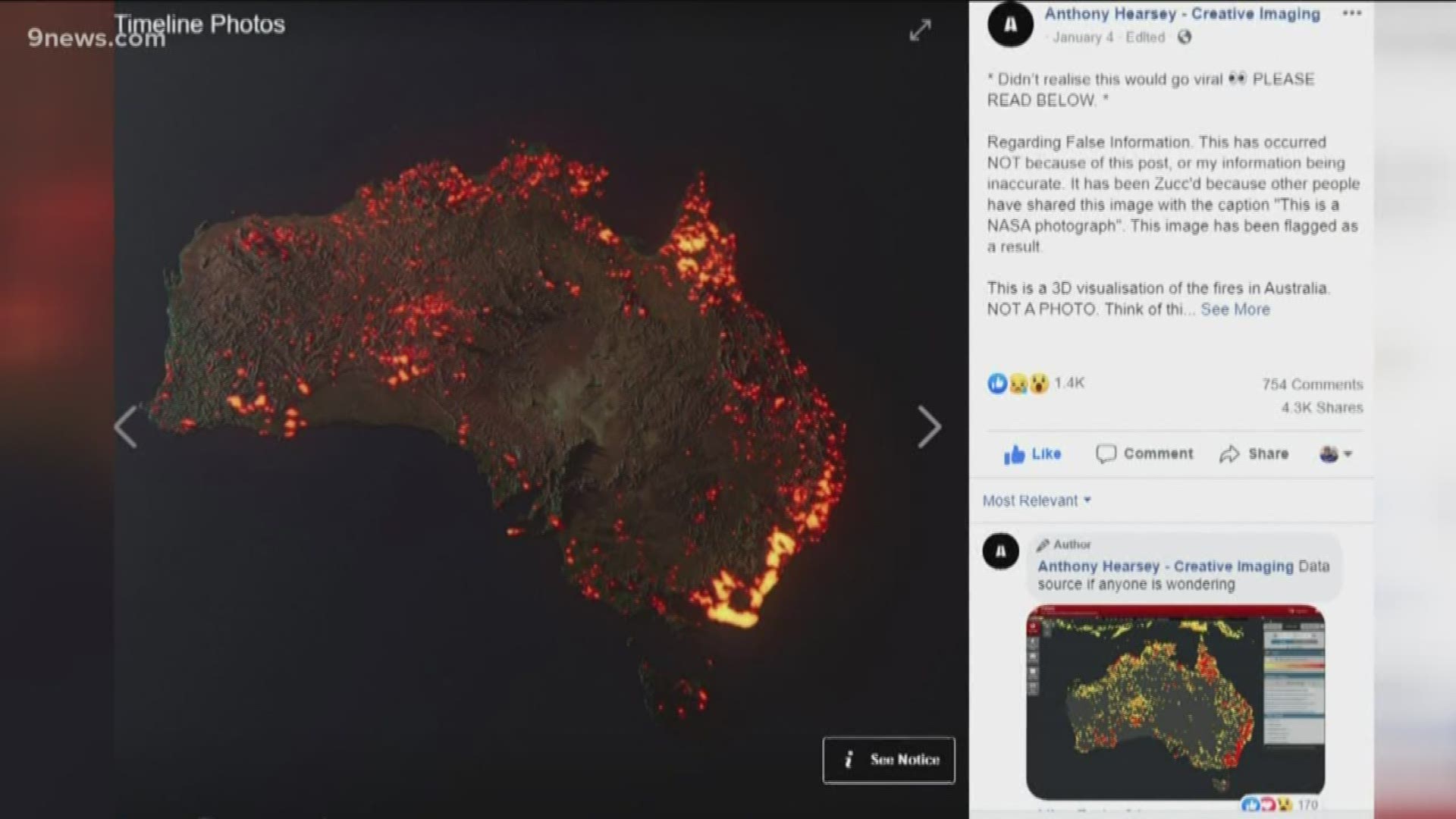
FORT COLLINS, Colo. — The creator of an image depicting the Australia brushfires disagreed with groups who said the image is fake.
The image's owner, Anthony Hearsey, said the image is not, in fact, fake — just misinterpreted.
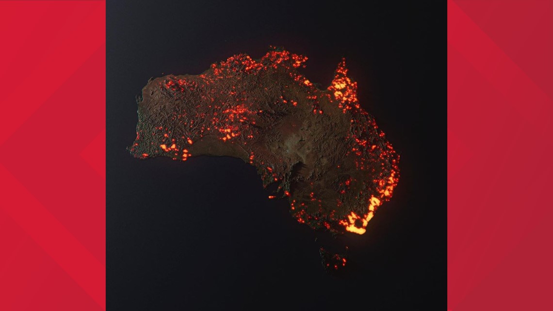
It shows areas burned by the recent bushfires in Australia.

The Australia brushfires have cost more than two dozen lives, impacted nearly half a billion animals, destroyed or damaged thousands of homes and other structures, and cost millions of dollars.
Hearsey told 9NEWS in an email that everything in the image is true to scale, but the problem is that his image was stolen by several users on social media and labeled a photograph, or a satellite image, which it is not.
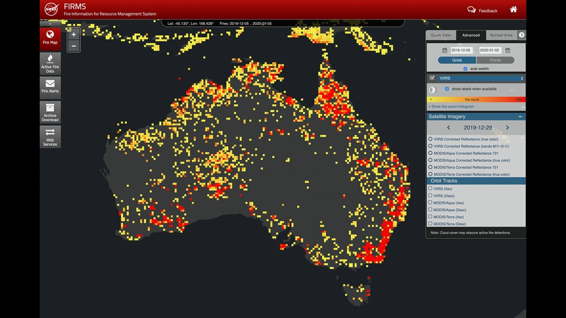
He said that his intent was only to help people visualize how much of Australia has burned. To do this, he said he used satellite data from NASA's Fire Information for Resource Management System (FIRMS). That information gives accurate data points to how much area has burned by fire and where that burned area is located.

Hearsey said he used data from Dec. 5, 2019 through Jan. 5, 2020, since his intent was not to show how much is currently burning, but how much has already burned.
Then he overlaid that information on a different map of Australia that he said is true to scale, with the exception of the topography. He said the mountains and rough landscapes were exaggerated intentionally as part of his artistic interpretation.
He is learning 3-D mapping, and he said the fire map was the perfect tool for him to use because of all the fine detail offered in the data available.
So, the information is accurate, as long as you understand that it is not a photograph, and it does not show a single moment in time, but a composite of all the fires in Australia over an entire month.
9NEWS created a similar graphic: It uses the very same FIRMS data from NASA that Hearsey used in his graphic.

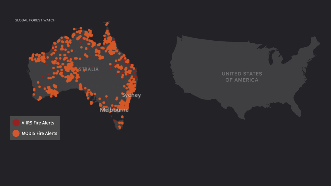
The two sources listed on our graphic are the names of the instruments on the satellites that gathered the FIRMS data. The Visible Infrared Imaging Radiometer Suite (VIIRS) and the Moderate Resolution Imaging Spectroradiometer (MODIS).
Both Hearsey's and the 9NEWS graphic are completely computer-generated graphics, but it is likely the realistic appearance of his that causes the confusion.
There is another type of image that is in between a photograph and a computer graphic, which takes the argument of what is real and what is fake even further.
Satellite images that use actual wavelengths of light can be created to give the appearance of fires on the ground. The light is real, the location is real, the time-frame is real, but the image needs to be altered for people to understand.
“You're not seeing actual flames," said Matt Rogers, and Atmospheric Scientist with Colorado State University (CSU). "We use the color tables to make it look like fire because that is what the human brain is conditioned to see."

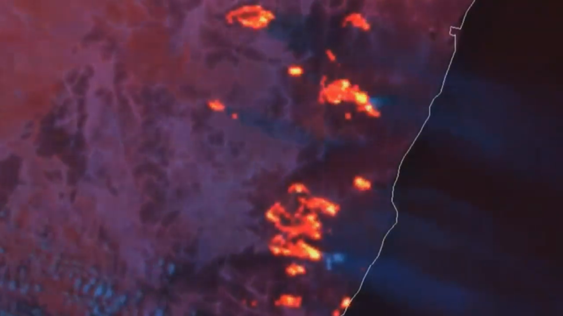
Rogers said the product is called the Fire Temperature RGB. They can arrange the data from the red, green and blue imager on the stationary satellite over Australia to make the data coming from the fires look like the actual fires themselves.
The satellite they get the information from is called the Himawari and is operated by the Japan Meteorological Agency. Rogers said it is fairly easy to program the data from that satellite because it has an imager for all three colors.
The American versions of that satellite are the GOES-East and the GOES-West. They only have a red and a blue imager, so meteorologist have to create a synthetic green, which makes the filtration algorithm a little more complicated.
This Fire Temperature RGB product was developed at CSU by the Cooperative Institute for Research in the Atmosphere (CIRA) department. It's a partnership with NOAA that allows students and professors at the university to develop satellite products for real applications.
The tweet (below) shows the bushfires in Australia with the Fire Temperature RGB product, and the smoke with another product developed at CSU called GeoColor filter.
The product was not just designed to show the public where the fires are burning, but it can also be used in fire forecasting and for fire detection.
If this product was available back in the summer of 2012, the High Park Fire in Larimer County may have been a different story. That wildfire in the mountains west of Fort Collins burned more than 87,000 acres and was sparked by lightning. It also destroyed 259 homes and displaced hundreds of residents.
"That was a very small fire that smoldered for a couple of days before it really took off," said Rogers. "We think maybe if we had something like the GOES-R series of satellites back then, we might have been able to detect that fire ahead of time, and then would have been able to deal with it a lot sooner.”
The Fire Temperature RGB product was developed when the first GOES weather satellite became operational in 2017.
The Denver Zoo said it will donate $5,000 to Zoos Victoria. Zoos Victoria animal care experts are providing care, food and water to animals injured in the fires. The Denver Zoo also announced it will match up to $5,000 from donations collected via its Field Conservation Fund.
SUGGESTED VIDEOS | Science is Cool